No matter if you are running paid marketing campaigns or eyeing converting your email list subscribers, landing pages play a deciding role. A newbie marketer would have redirected the hard convinced traffic (leads!) on their homepages or internal pages. It’s great you chose landing pages, and today, I will spill out the secrets I learned from observing a smart email developer and paid marketing professionals on building winning landing pages best website design companies.
Table of Contents
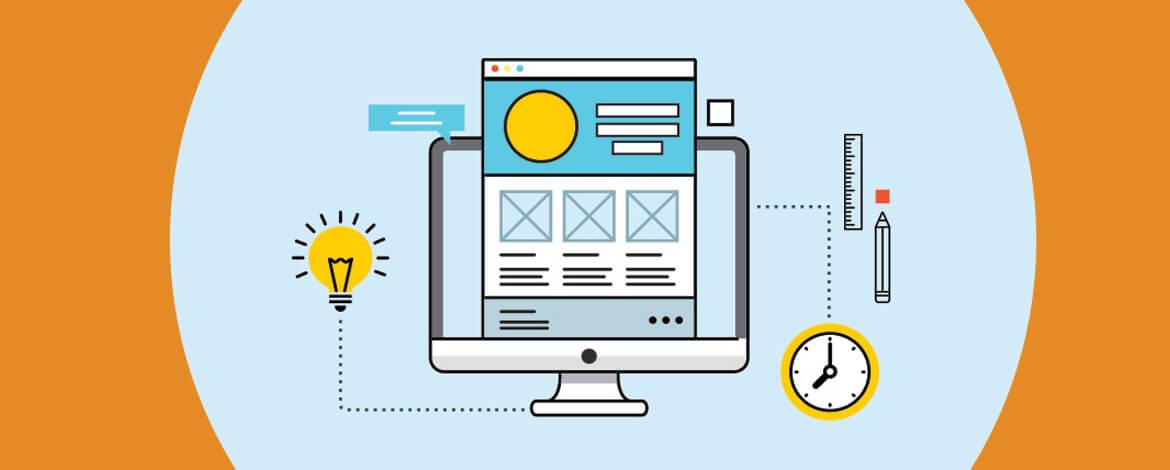
What Is a Landing Page
A landing page is identical to other web pages on your website except that it is specially designed to serve inbound traffic arriving after consuming your marketing material.
Here’s what goes into building high-converting landing pages:
#1 Keep It To The Point
When designing your landing page, make sure you include all information needed for the reader but don’t take it too far. Firstly, it will overwhelm your visitors, and secondly, they would have already consumed enough information before they get convinced to arrive at your landing page. Short and sweet is the first success mantra for all landing page designs.
#2 Use Highly Refined Content
Working with minimum words requires creating maximum impact with your copywriting. You should always use compelling headlines combined with persuasive copy that confirms their intent. Also, use subheadings to complement your message. Use a writing tone that makes your copy feel personalized, easy to visualize, and self-sufficient.
![Photo of [Latest 2024] 15.1.1.1 Circle Network _ FTP live TV Server _ IP Address 15.1.1.1](https://www.todaytechnology.org/wp-content/uploads/2021/09/todaytechnology-220x150.png)


#3 Limit Exit Points
Every cleverly designed landing page limits the exit points, i.e., hyperlinks. Ideally, your landing page resembles the door/counter from where the prospect shouldn’t walk away. These act as distractions and they can start leaking your most warmed leads right before they put their hands in the pockets. Be picky about the hyperlinks you use, including the social sharing buttons, to minimize the potential losses. All buttons/hyperlinks should ideally lead to conversion.
#4 Use Clear Call-to-action Buttons
A winning landing page makes it easy for the reader to find and click the CTA button. You should use a contrasting color palette for your button and its background while keeping its size slightly bigger than normal works like a charm. You should maintain a lucid aspect ratio with its surroundings and use power words for your CTA copy. I find that demonstrating tangible benefits in CTA buttons is a smart move, while you can use A/B split tests to find out what works the best for you.
#5 Make It Visitor Oriented
Remember I told you not to use pushy language in your landing pages? What you should do instead is to keep your copy and images relevant for the visitors. Take the opportunity to connect with your visitors, resonate with them, serve them, and reassure them. This brings more conversions to the table than bragging how great your products are or how you envision your brand.
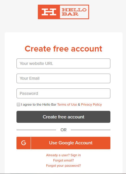
#6 Ask For Bare Minimum Information
You should stick to a bare minimum when asking for the subscriber’s information. Having fewer fields will make your visitors more comfortable giving their information while reducing the overall time required in the process. Name and contact details should do the job in most cases, while you can use “Sign in with Google” or “Sign in with Facebook.” By no means should you ask for too many personal details or business-related data because you will always get the opportunity to do so unless you scare them off with too many questions?
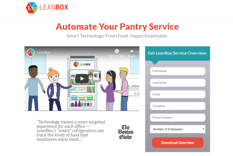
#7 Leverage Social Proof
Over 92% of the people find genuine (unpaid) customer reviews more trustworthy than any other marketing material. Also, we tend to seek social proof naturally as 82% of Americans ask for reviews from their kin before making a purchase. Apart from your customers, you can also leverage the social proof in the form of recommendations from authoritative figures like in the below example:
#8 Keep Your Design Mobile Friendly
It is no secret that mobile optimization is becoming a basic necessity since almost half of the world’s traffic comes from mobile devices. To make your landing page mobile-friendly, keep at most two content blocks adjacent to each other and focus on building a vertical layout. Mobile optimization helps improve user experience and ensures that you don’t lose leads simply because your landing page took too long to load or didn’t fit in the user’s screen.
#9 Add a Thank You Page
Who doesn’t like to hear a thank you? You can add a thank you page after the user fills out the details. However, that’s not only a good gesture, but it is also a good opportunity to showcase product details, display product suggestions, or give FAQ answers to improve their buying experience. This way, you can improve the utility of your landing pages. I also find it a good way to pack the content you couldn’t add to the landing page to keep it concise.
Wrapping Up
There’s no doubt that these landing page design tips will help you win paying customers, but there’s one thing I would like to add here: Know your customer, competition, and goals. Follow these suggestions, and you will surely create winning landing pages for your next campaign.
Author Bio:
Kevin George is Head of Marketing at Email Uplers, one of the fastest-growing PSD to Email coding companies, and specializes in crafting professional email templates, custom Mailchimp email templates design and coding in addition to providing email automation, campaign management, and data integration & migration services. He loves gadgets, bikes, jazz, and eats and breathes email marketing. He enjoys sharing his insights and thoughts on email marketing best practices on his blog.
Follow Today Technology for more!