Nowadays, most consumers are gradually switching from their traditional desktop to shopping online using tablets and mobile phones. Even a study shows that 60% of consumers use their mobile devices to browse online, while only 40% still depend on their desktops.
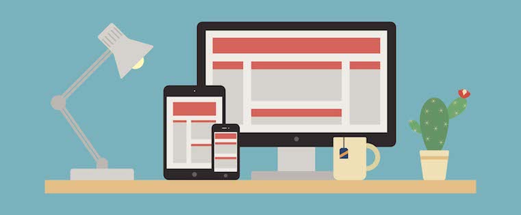
For that reason, it is essential for businesses that run e-Commerce websites to implement a mobile-friendly format to support different types of devices. Do you feel your e-Commerce website needs to be responsive? If yes, we would highly recommend you to approach a dependable web design company for an upgrade. By doing this, you’ll be able to keep up with or beat your competitors.
Table of Contents
8 reasons why your e-commerce site needs a mobile responsive design
Apart from giving your customers an exceptional online shopping experience, a responsive e-Commerce website comes with many benefits. Here, we’ll take you through some of them.
-
Improved UX (User experience)
Consumers can be very picky when it comes to websites, especially if they will need to use one regularly. Among the first things they consider about a website is whether or not it is mobile-friendly or responsive. While a mobile-friendly website is usually regarded as responsive, it does not apply to all sites. A website can be mobile-friendly and not responsive, resulting in a poor user experience.
Suppose your website is intended to target mobile audiences; it can be very frustrating because every time consumers are shopping, they have to use the screen to zoom, pinch and expand web pages. On the contrary, consumers can enjoy an organized, clean, and intuitive user experience if your website is fully mobile-responsive.
-
Ability to gather customer data for upcoming campaigns
With a vibrant mobile website, you’ll be able to keep track of your consumer’s behavior and data. You can either view or gather these details directly or indirectly. If you want to use the information for your Google Analytics and ad campaign, you can see what stage of buying process most of your customers stop. And as a result, you can come up with ways to improve their purchasing experience.


Another excellent way of obtaining information about your customers or prospects is creating mobile forms to get their thoughts about your site. Some of the details you can gather to help you make changes include prices, website design, and mobile layout.
-
An excellent method to boost sales
If you integrate a responsive web design, it will help boost your sales as it appeals more to an audience. Since it can adapt all your consumer’s devices, someone with a mobile phone can shop comfortably from their small screen.
In the same way, users enjoy an excellent experience with their desktops, which won’t be different with mobile phones. Hence, you can expect increased sales for your business. Besides, a responsive e-Commerce website allows consumers to view products more clearly, allowing them to make an effortless purchase.
-
For better SEO
A responsive website improves search engine rank because irrespective of the device a customer is using, they can access a site with a single URL. Since there is no sharing of visitors, SEO will give your website total concentration. As a result, this will highly boost the ranking.
Moreover, instead of having separate web versions of mobile and desktop, a single responsive website helps in avoiding issues of duplicate content. Apart from that, you will have higher search rankings due to better bounce rates and stronger backlinks integrated into a responsive site.
-
Fast website loading
If your website has a responsive design, it will take less loading times on all devices, specifically tablets and smartphones. Therefore, if your website has responsive fluid grids and images, the pages will load much faster, which has a significant impact on the duration your consumers visit.
According to studies, mobile users are likely to abandon a site that takes more than three seconds to load a page. Similarly, sites that take fewer periods to load benefit from better conversion rates and more time spent by visitors. As you can see, that speaks volumes about the importance of a responsive web design.
-
Boosted social sharing
A correctly designed website can result in a rise of social shares for your content, which greatly benefits a business. But how does that happen? Pairing responsive content with responsive social media buttons allows visitors to share your web pages on their mobile screens. Consequently, you’ll be able to gain creditability and exposure to new clients, thereby increasing conversions and traffic.
Apart from that, you’ll see a significant change as social signals can influence indirect search engine ranking. This is likely to happen because search engines are fast to notice search demand and increased engagement.
-
Cost-effective in the end
While you might find the cost of integrating a responsive e-Commerce website pretty expensive, it is cost-effective in the long run. For instance, you will only pay once to build the website. However, e-Commerce sites need frequent updating compared to regular websites.
Not to mention, it can be expensive and tedious to keep two different sites, but designing a responsive site will become much more straightforward. Although with a responsive website, you’ll incur some extra cash, trust us, you’re going to enjoy substantial savings in the future.
-
Maintenance is much easier
Your development team or staff will have to divide resources and time if you have two versions of websites. However, suppose your e-Commerce website is responsive. In that case, maintenance won’t take much of their time, allowing them to focus on much more essential errands like marketing, content or product development, customer service, and A/B testing.
Conclusion
Mobile-responsive web pages come with many benefits to e-Commerce sites, including increased sales, and improve SEO ranking. Since technology has been changing rapidly over the years, having a responsive and mobile-friendly website is the way to go. Besides, if you combine the right plugins, themes, and applications, you’ll be able to give your customers an excellent user experience despite the device they use to access your site.
Follow TodayTechnology for more Technology, Business, and Digital Marketing News.